Over the last eight months we’ve had the opportunity to do just that. Through conversations with employees, clients, and partners across WPP and externally, we refreshed our brand to better reflect our ethos and took the opportunity to refine and simplify our messaging.
Committing to the purpose
In a time and industry where privacy regulations have expanded, platform policies have evolved, consumer awareness has increased, and consumption habits have changed (and all at the same time), we have an obligation to reduce complexity and demystify the ways in which data is collected, interpreted and applied. So our purpose remains — Data with purpose. Fuel for growth. — but today, I’m incredibly excited to welcome you to the new Choreograph brand.
Connecting the dots
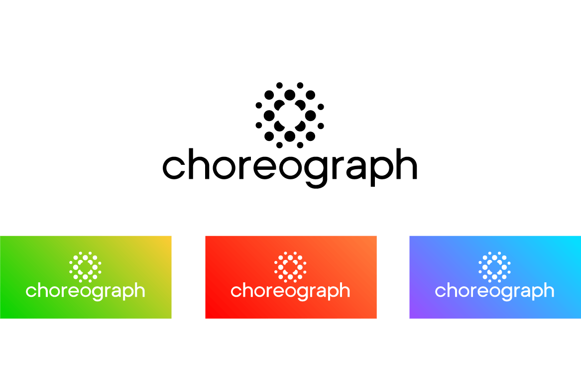
Our logomark is what brings our brand to life. It’s built from dots, which can be a very literal representation of what we do. Together, the dots form an octagonal grid matrix (and I’ll come back to that momentarily) that create structure and organization within the symbol. The cutout circle in the center represents the power of an insight. A moment in time that is captured, but only revealed as the data that surrounds it comes into place.

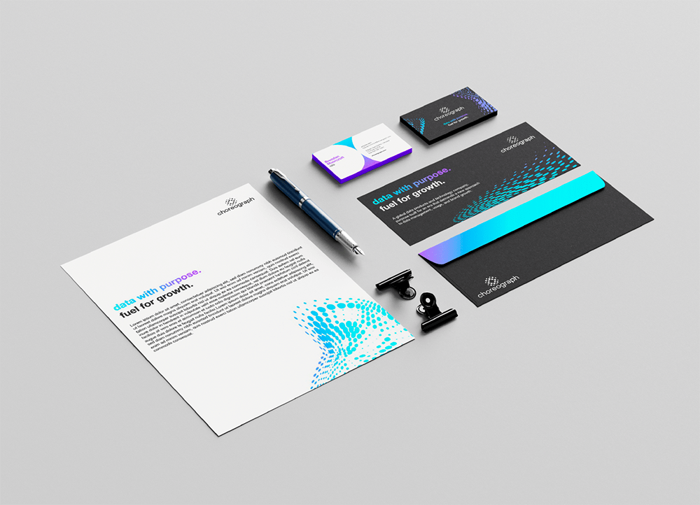
The grid matrix became the basis for the rest of our visual identity. Modifying it to represent how data can come alive to reveal something new and interesting allowed us to make complex, yet standardized, forms. We can adjust profiles, going from dense to sparse and back. We can rotate it in three dimensions to make it more dynamic. We can play with the size of the individual dots to create a visual heatmap.


And we can zoom into specific areas, use color in the negative space and create another interesting element that is still grounded in the original grid system.


Clarifying the offering
The brand refresh provided the opportunity to imagine an entirely new visual identity for ourselves, from logo and color palette to typography and photo direction. We also recognized the opportunity to reexamine the complexities of our product narrative alongside our newly defined and refined brand language.
With the goals of clarity and simplification in mind, we organized our offering across three key product suites:
- Sync: data ownership facilitation. allowing brands to build, own and control their data assets and identity solution
- Compose: data enrichment and simulations. helping to expand understanding of customers and prospects
- Perform: data-driven activation and optimization. planning, activation, management and optimization of media and creative
Using the basis of our logomark, we carved out three unique symbols to independently represent the three product suites. Together, they form the whole logomark — and Choreograph.

Charting the course
As most brand refreshes are, this was a labor of love and a true team effort with support across the entire organization. It was an enormous undertaking and I’m so proud of the work from our incredible team who made this happen alongside some talented and trusted partners. This refresh marks an important step in our journey as Choreograph with many more exciting milestones to come!


